BAE Systems
Building a User-Friendly System for Large-Scale Data Analysis

Who is BAE Systems and Its Goals
BAE Systems, a leading British multinational defense, aerospace, and security company, needed a new enterprise platform to help analysts efficiently interpret and act on large, complex datasets.
Problem: The existing tools were fragmented and difficult to navigate, slowing down workflows and making it hard for users to draw meaningful insights. Operating within a secure government environment, our challenge was to create a cohesive, user-friendly system that streamlined complex analysis while meeting strict security and technical constraints.
Quick disclaimer: This project is contains confidential information, so details are kept minimal to protect sensitive information. The examples here focus on process and design approach rather than specifics.
My Role
Assistant UX Design Lead
Platform
Mobile responsive website
Methods
User Research, Competitive Audit, Building Design System, Sketching, Wireframing, Prototyping, Writing Annotations
Tools
Figma, Confluence, Adobe XD, Adobe Illustrator, Microsoft Suite
PROBLEM
Users lack a centralized way to analyze data quickly
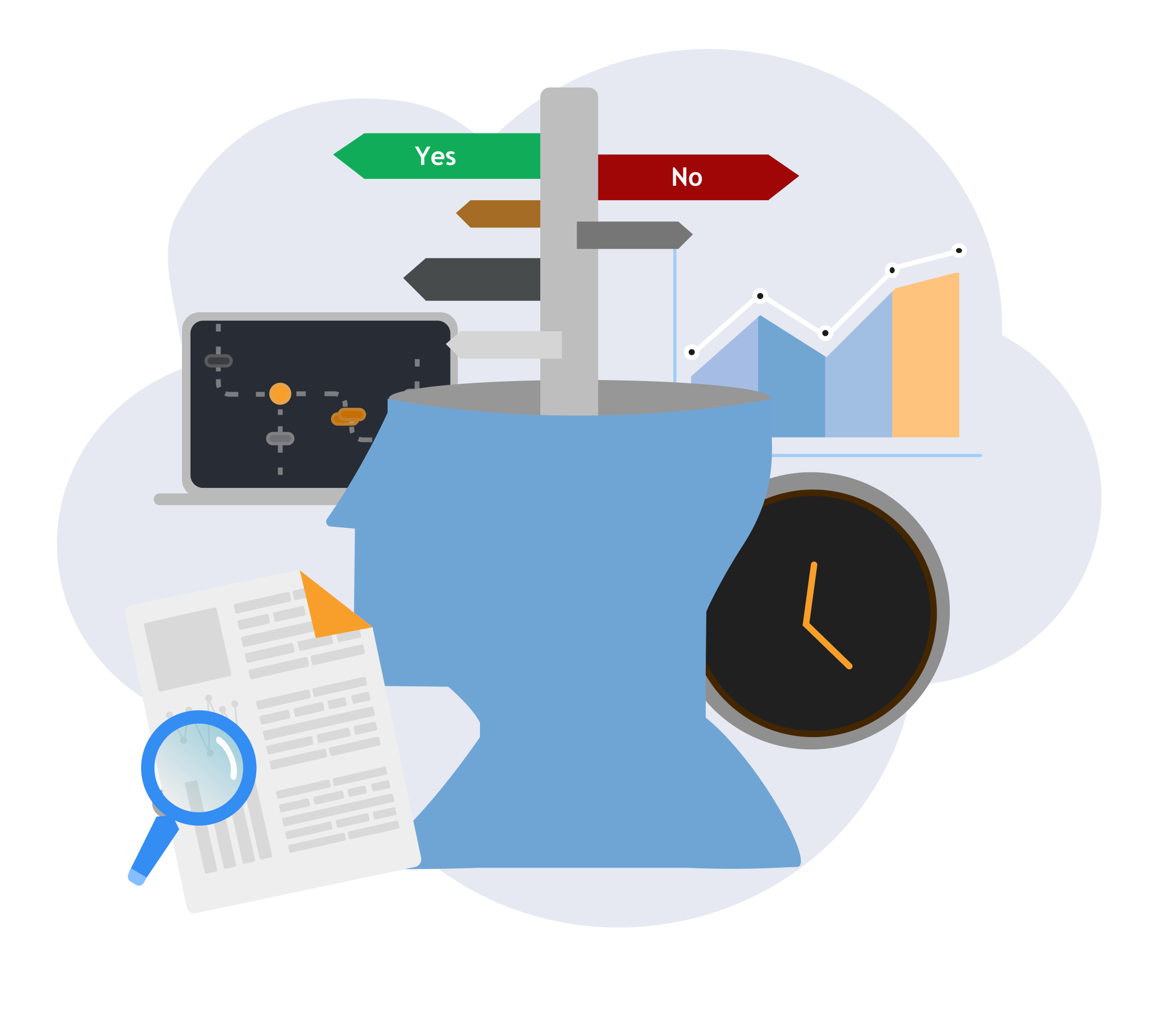
Upon taking on this project, there were user problems noted from existing systems which include:
Analysts struggled to quickly find and interpret relevant insights within large, complex datasets.
Users faced a lack of a centralized place to analyze data — information was scattered across multiple systems.
Users needed to cross-reference multiple data sources, but workflows were slow and cumbersome.
Users needed highly secure access controls without creating friction in daily work.
Collaboration between teams on insights and analysis was inefficient or fragmented.
Existing tools and prior prototypes were outdated and didn’t match the efficiency and usability of modern technology.
SOLUTIONS
How might we allow users to analyze data quickly and user-friendly way?
1
Centralized, intuitive dashboard that unify scattered data
We created a unified environment where analysts can access and analyze all relevant data in one place, making insights easy to identify and eliminating the need to analyze data across multiple locations.
This is an example for illustrative purposes and does not represent any actual data.
2
Cohesive & Modern UI
I led the creation of a cohesive design system, following Material Design principles and leveraging FontAwesome icons, to deliver a modern, engaging UI that makes complex data approachable, intuitive, and visually engaging.
3
Enhanced Collaboration
We redesigned the tool to enable collaboration, letting teams share insights and work together efficiently within a unified platform, that took into account security measures. In the prior user workflow, the experience was limited to chats and more extensive procedures to share ideas, projects, and insights.
DESIGN APPROACH
Our Design Approach: 12 Week Sprints
This project operated in 12-week design sprints, each consisting of six 2-week increments. In each sprint, the UX team focused on designing 2–3 features that would be implemented in the following sprint. We followed a cyclical approach that included planning, collaborating with mission engineers on user needs, exploring concepts, validating feasibility, and refining designs through feedback—ultimately moving from initial ideas to user-validated solutions presented to the customer.
Beyond designing and reviewing mockups, I worked closely with the UX lead to refine our internal workflow (see below), align with architecture and engineering leads on priorities, and represent UX in cross-functional engineering discussions to ensure design considerations were integrated throughout the process.
Communicating regularly with research team and conducting remote user testing provided user insight
UNDERSTANDING THE USER
Due to the sensitive nature of the information designed, the details around our users cannot be shown but below is on our process. To arrive at personas and user journey maps, we leveraged existing user data and our research team to gather all information. This provided a foundation for how we designed wireframes for each feature. Each quarter, we were introduced new features to design. Although we have the personas and user journey maps as a reference, we continuously gathered user information from performing the following:
Meet with User Research Team Frequently
Who performed this? I, along with my team
What was performed? Ad-hoc conversations and scheduled meetings were performed to discuss use cases
Why? We met with our research team to understand use cases throughout the feature design lifecycle mentioned above. This ensured we designed in a user-centric approach
When were these performed: Daily basis
Perform Remote User Testing within Short Sprints
Who performed this? I, along with my team
What was performed? I and another designer would facilitate remote testing sessions where we either asked users questions about design concepts or performed ideation with users where we obtained a scratchpad of their designs. We also collected survey data to obtain satisfaction ratings as well as additional ideas that weren’t communicated.
Why? These were performed to support features that had little user information where we needed to gather user support within a short time frame to inform an initial concept
When were these performed: Once a quarter basis
t’s important to note that these are not an either/ or type of research method between the both above but are made in conjunction with each other. The former where we meet the the user research team, is more unscheduled, where we can ask for support when we need to fill in any gaps in use cases. The latter is more limited to a time in order to get our creative juices flowing for topics where we and the user research team need more data.
WIREFRAMES
We sketched and created low-fidelity wireframes
In each 12- week sprint, the UX team focused on designing 2–3 features that would be implemented in the following sprint. During each quarter sprint, each UX designer led features to bring to low-fidelity by the end of the 12-week period. This consisted of competitive audits,sketching, then bringing the design to low fidelity, iterating. The flow can go back to other steps where needed and is not linear.
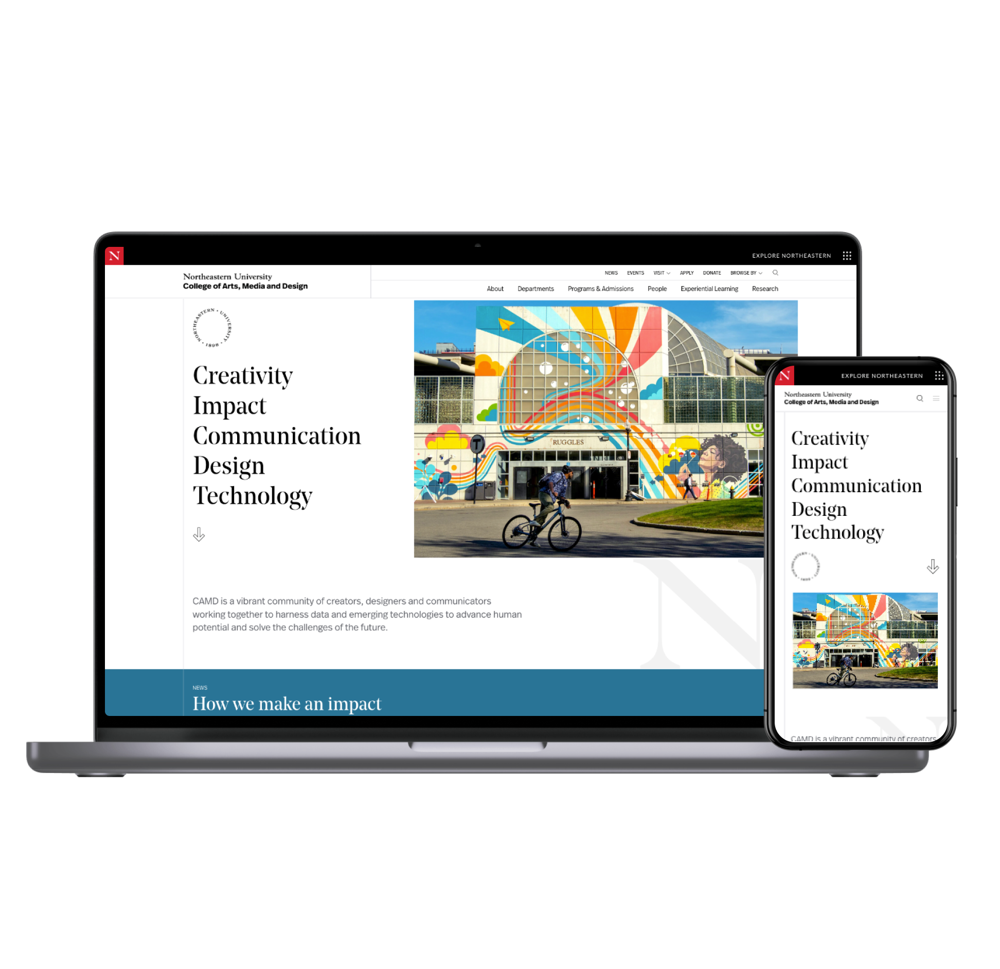
This design flow is similar to what I’ve done in other projects like Northeastern CAMD. After this lo-fidelity design is complete, we discuss feasibility with developers and begin the high-fidelity wireframes and refine.
VISUAL DESIGN
Building and managing the design system from the ground up
A key part of my role was leading the creation of our design system. Because this was an entirely new product with no existing design foundations, I researched best practices and developed a strategy to integrate design system development into our ongoing workflow. In collaboration with developers, we aligned on using Vuetify, an open-source library based on Google’s Material Design, as the foundation for our components, and FontAwesome for icons.
Our process was structured in two phases: initial design (exploring and defining components) and final spec(documenting in Confluence and Adobe XD and delivering production-ready designs). The below became the acceptance criteria for Jira tasking.
Phase 1: Initial Design
Research Vuetify Standards and analogs where relevant, depending on if the component can follow Vuetify/Material standards or if it’s a custom component
Compile feasibility questions to bring to developer review
Create and refine a light design
Obtain feasibility signoff with the developers

Phase 2: Final Spec
Document redline annotations for components with a table of specs in the internal wiki page
Add the final component to the master design file for UX to easily grab and use
To arrive at the foundational areas, the colors and typography, we went through mood board exercises with the customer to identify the look and feel of what they wanted for their system and arrived at the color palette, from Material Design’s theme builder, and the typography specs below:
Once the foundational elements were established, we then began designing components. Here’s an example of a snackbar I worked on:
Due to information sensitivity the full design system and Confluence wiki documentation cannot be presented. The final set of components included a variety of standard components such as buttons, cards, data tables, chips, menus, tooltips, text fields, as well as a set of custom components for cards, card containers, and others more specific to the system.
We faced challenges designing with large teams trying to establish our design process
CHALLENGES
Balancing Speed, Collaboration, and Feasibility
As a new product built by a newly formed UX team, we had to ramp up quickly and stay agile. Working across multiple teams with different goals was challenging—UX prioritized usability, while developers focused on feasibility and delivery. Finding common ground required constant collaboration, quick iteration, and flexibility to meet client expectations.
Shifting the Design Process Midstream
Early on, system engineers were driving the design approach, with UX brought in late to validate functionality. This limited our ability to advocate for user needs and design without limitations. We also started with lo-fi concepts but had little time to evolve them into high-fidelity mockups within the design system. Over time, we shifted to involve UX from the start—leading with research, then design, followed by developer feasibility checks—which closed gaps and improved both usability and delivery speed.
Shifting from Lo-Fi to High-Fi Under Constraints
We initially began with low-fidelity concepts, but customer priorities shifted, and less time was allocated for building out high-fidelity mockups and integrating them into the design system. This forced us to prioritize functionality over style to reach initial operating capability, while still ensuring usability. While we were able to advocate prioritizing design system work to improve the look and feel of the application, we still had to do some negotiation to implement the more critical components now and less critical later.
RETROSPECTIVE
Looking back but going forward
Looking back, these challenges shaped how we work and helped me grow tremendously.
We learned to align early across UX, engineering, and product so usability, feasibility, and delivery goals stayed in sync.
Involving UX from the start helped us shift from reacting to proactively designing, which sped things up and improved quality.
We found ways to balance speed with polish by building design system foundations while still delivering core functionality.
Our collaboration got stronger, with clearer roles, faster feedback, and a smoother design-to-delivery process.
On a personal note, this project was incredibly rewarding. I joined as a mid-level designer and was promoted within the same year. Being able to shape major features and watch the product come to life was such a meaningful experience, one I’m excited to carry forward into future work.