Northeastern University College of Art, Media, and Design
Unifying CAMD’s Brand and Improving Access with a UX and Visual Refresh
Understanding CAMD and Its Goals
Northeastern University College of Art, Media, and Design(CAMD) an interdisciplinary college focused on leveraging data and emerging technologies to advance human potential through the arts and design.
The college needed a comprehensive visual and UX redesign of its mobile-responsive website to improve information access, reflect its prestige, and clearly communicate the breadth of its offerings. The existing site felt outdated, with a fragmented user experience that failed to support the university’s brand and goals.
My Role
Interaction Design Intern
Platform
Mobile responsive website
Methods
User Research, Competitive Audit, Sketching, Wireframing, Prototyping, Writing Annotations
Tools
Figma, Confluence, Jira, Airtable
Timing
2023-2024
PROBLEM
Original website was outdated and was not user friendly
Lack of Differentiation: CAMD’s unique programs and interdisciplinary strengths aren’t visible or highlighted. At first glance, its not clear what differentiates CAMD from other schools.
Disjointed Navigation and Information Architecture: Each school/discipline takes the user to a new site experience with a new navigation which can disorient a prospective student who is just browsing the general CAMD offerings
Weak Storytelling & Brand Expression – The experience feels utilitarian and monotonous, missing opportunities for interactive, multimedia storytelling that reflects CAMD’s prestige and creativity.
Buried and Misleading Content: Valuable content (e.g., student stories, resources) is hidden deep in the site, while some CTAs mislead or confuse users.
Inconsistent UI Patterns – Components like accordions behave differently across templates, creating friction and inconsistency in the user experience
Through a site audit, the team identified a few core issues with the overall user experience:
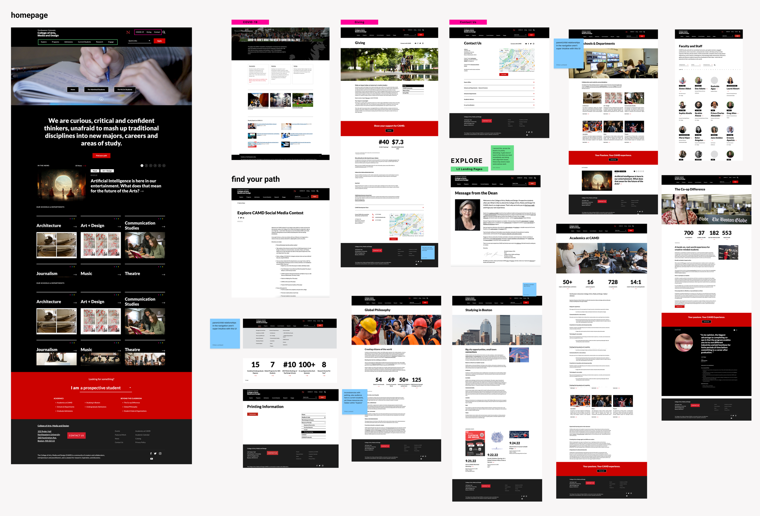
Snapshot of site audit for the original CAMD website
SOLUTIONS TO THE CHALLENGES
Solutions to the Challenges
1
Utilize content and storytelling to establish unique value and offerings
The team reimagined CAMD’s homepage and landing pages to highlight key value upfront, adding interactive content and varied layouts for a more engaging experience.
2
Human-Centered Storytelling
We enhanced storytelling by incorporating human-centered media and narratives that highlight achievements and foster connection. By showcasing bios with contact information, we gave users a relatable glimpse into the possibilities within CAMD and what they could achieve
3
Architect a flexible, scalable frameworks that’s built to last and grow over time
We restructured the sitemap, created customizable templates and a streamlined the navigation system to adapt to evolving departmental needs and guide users seamlessly.
UNDERSTANDING THE USERS AND COMPETITORS
Users are interested in gathering information about their program of interests easily
As I rolled onto this project during the user research phase, my pre-work to designing was to understand the users and competitors. To start, I gathered user artifacts and noted that students were interested in understanding their programs in various areas from faculty, career, to what the program offered. Additionally, given that students are of the Gen Z generation, they live in a digital world that favors engaging storytelling that feels relatable. These were things to keep in mind for the wireframe designs.
Personas:
Personas and user journey maps below:
Journey Maps:
Competitors had better storytelling with engaging and interactive graphics that capture the brand
Next, my team and I performed competitive audits of full page designs and of specific sections of competitor sites. Seen below, competitors have more graphics that capture the collaborative nature of programs and create story that feels engaging and relatable to users. Additionally the information architecture of competitors were more intentional and organized to allow quick and easy wayfinding.
Competitive audits of the various home pages:
Competitive audits for a specific section. Example below is for the global navigation:
DESIGN
Designing with Intention
Before moving into designing wireframes, our team prioritized structuring pages and sections into clear content zones, each with a defined purpose. This ensured that every element addressed CAMD’s user needs and intents, rather than adding unnecessary or disconnected sections.
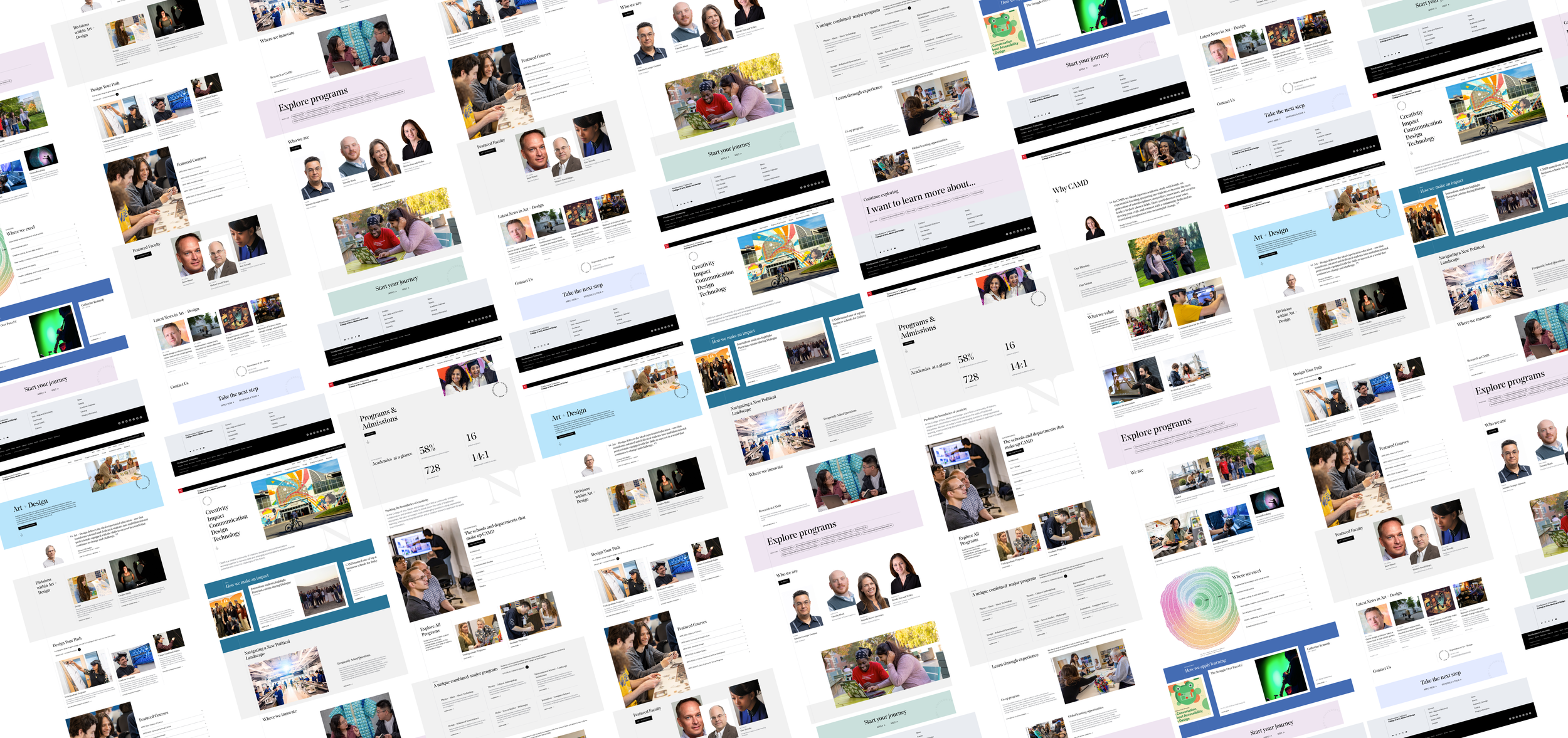
After completing zone diagrams for the various templates we wanted to apply across CAMD, we then created mid-fidelity wireframes and presented them to the clients. I primarily assisted with the landing page designs and translating them to mobile wireframes. Here’s a few examples of the wireframes I worked on:
After collaborating with research, and product on the wireframes, we passed the mid-fidelity wireframes to the visual design team to come up with the final design as the below:
Collaborating with Visual Design
BRIDGING DESIGN AND DEVELOPMENT
A key part of my role was creating detailed annotations in Figma and Confluence to guide developers with precision and clarity. Drawing from my accounting background, I applied the same attention to detail I once used in audits—spotting inconsistencies, investigating gaps, and ensuring nothing was overlooked. These annotations were documented in Confluence alongside Jira tickets, where I also troubleshooted developer questions and advised on design changes.
Working with developers required detailed annotations and specs
Below are screenshots of annotations I wrote in Figma. Here’s a PDF example of an annotation.
RETROSPECTIVE
Looking back and thinking forward
This was an incredibly rewarding opportunity as it was one of my early UX experiences designing for a large enterprise. There were a few takeaways I took from this opportunity:
Communicate with clients earlier: At times, we focused heavily on specific design elements, like a landing page hero image, that may not have required as much effort had we communicated earlier. Those led to some delays in our internal workstream. In hindsight, I would encourage earlier exploration and discussion on areas where the client has strong opinions to reduce rework and streamline the process. Overall, this was an incredibly meaningful project—working at scale for a major client and directly impacting a core audience.
Ask questions ahead and together: This project involved close collaboration across a large internal product team, including producers, interaction designers, copywriters, visual designers, and experience strategists. Balancing the internal team’s needs with the client’s expectations was an important part of the process. If there’s a question for one team, it’d likely trickle down to other teams, so it’s important to get the right people involved early.
This was also one of the projects where I got to dip my toes in each of the various departments which was a perk of being an intern. Really grateful for this opportunity which jumpstarted my career in UX.