Big Cojones Golf
Play Bold, Miss Gracefully:
The Big Cojones Story
Who is Big Cojones Golf and the its Goals
Big Cojones Golf, is a start-up golf company set out to elevate the fun of golf with high-quality play. The company aimed to provide an experience of fun (through its brand) by making these balls “fun” to lose, while also serving the community through contributions to underserrved children in hospitals. The founder brought me on to design the brand, packaging, and website, shaping a cohesive experience from the ground up.
My Role
Freelance Product Designer
Platform
Mobile responsive website
Methods
User Research, Competitive Audit, Sketching, Wireframing, Visual Design, Package Design, Branding
Tools
Figma, Squarespace, CSS
Time
2023-2024
PROBLEM
Not as many golf brands provide a feel of fun , class, and community giveback
The client felt that it was less frequent in the market to see punny golf brands have a feel that also brings quality play. He wanted to create a brand that felt different. Although his brand has humor weaved into it, the client wanted to bring a modern feel that appealed to the lifestyle-oriented player while also emphasizing a sense of community impact.
OPPORTUNITY
Deliver a brand that felt classy, fun, and appeals to the lifestyle-oriented player
Logos
Packaging
Mobile Responsive Website
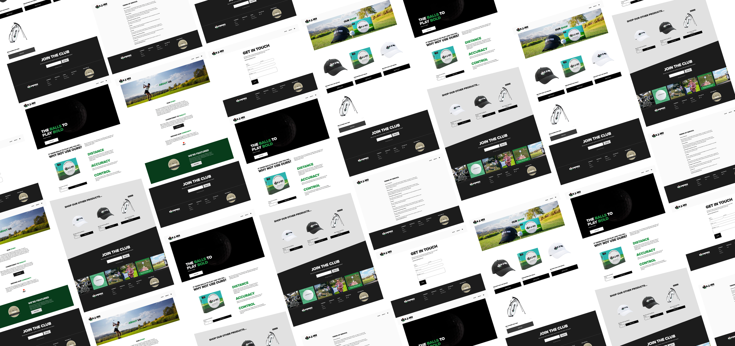
SOLUTION
Artifacts produced to showcase the Big Cojones Golf brand
1
Logo Package that is Fun and Modern
Light and dark mode logo that showcased the humor of brand in a modern decorative font.
Eye Grabbing Packaging
Packaging with bright colors that feels fun yet trustworthy
Information that showcased ball quality displayed on the main box and the sleeve
2
3
Website that Felt Modern, Fun, and Clean
Home page that showcased interactive graphics that appeal to the everyday user
Neutral palette with bold text that feels modern and sleek
Understanding the Users and Competitors
As I rolled onto this project during the user research phase, my pre-work to designing was to understand the users and competitors. I participated in competitive audits for specific web pages as well as for specific modules.
Understanding the User
Personas and user journey maps below:
Personas:
Journey Maps:
Understanding the Industry
Next, my team and I performed competitive audits of full page designs and of specific sections of competitor sites.
Competitive audits of the various home pages:
Competitive audits for a specific section. Example below is for the global navigation:
Designing with Intention
Before moving into designing wireframes, our team prioritized structuring pages and sections into clear content zones, each with a defined purpose. This ensured that every element addressed CAMD’s user needs and intents, rather than adding unnecessary or disconnected sections.
After completing zone diagrams for the various templates we wanted to apply across CAMD, we then created mid-fidelity wireframes and presented them to the clients. I primarily assisted with the landing page designs and translating them to mobile wireframes. Here’s a few examples of the wireframes I worked on:
After collaborating with research, and product on the wireframes, we passed the mid-fidelity wireframes to the visual design team to come up with the final design as the below:
Collaborating with Visual Design
Bridging Design and Development
A key part of my role was creating detailed annotations in Figma and Confluence to guide developers with precision and clarity. Drawing from my accounting background, I applied the same attention to detail I once used in audits—spotting inconsistencies, investigating gaps, and ensuring nothing was overlooked. These annotations were documented in Confluence alongside Jira tickets, where I also troubleshooted developer questions and advised on design changes.
Below are screenshots of annotations I wrote in Figma. Here’s a PDF example of an annotation.
Retrospective
This was an incredibly rewarding opportunity as it was one of my early UX experiences designing for a large enterprise. There were a few takeaways I took from this opportunity:
Communicate with clients earlier: At times, we focused heavily on specific design elements, like a landing page hero image, that may not have required as much effort had we communicated earlier. Those led to some delays in our internal workstream. In hindsight, I would encourage earlier exploration and discussion on areas where the client has strong opinions to reduce rework and streamline the process. Overall, this was an incredibly meaningful project—working at scale for a major client and directly impacting a core audience.
Ask questions ahead and together: This project involved close collaboration across a large internal product team, including producers, interaction designers, copywriters, visual designers, and experience strategists. Balancing the internal team’s needs with the client’s expectations was an important part of the process. If there’s a question for one team, it’d likely trickle down to other teams, so it’s important to get the right people involved early.
This was also one of the projects where I got to dip my toes in each of the various departments which was a perk of being an intern. Really grateful for this opportunity which jumpstarted my career in UX.
